This is default featured post 1 title

Go to Blogger edit html and find these sentences.Now replace these sentences with your own descriptions.

This is default featured post 2 title

Go to Blogger edit html and find these sentences.Now replace these sentences with your own descriptions.

This is default featured post 3 title

Go to Blogger edit html and find these sentences.Now replace these sentences with your own descriptions.

This is default featured post 4 title

Go to Blogger edit html and find these sentences.Now replace these sentences with your own descriptions.

This is default featured post 5 title

Go to Blogger edit html and find these sentences.Now replace these sentences with your own descriptions.

Friday, August 26

Project Runway 9 - Off The Track


Although for some last challenge seemed like a team challenge, this is the official second team challenge of the season. This episode eliminated an entire "team" because Cecilia decided to quit joining Julie, who she helped finish her outfit last challenge. The four team captains were determined by a race around a track and the first four to finish the race would choose in the order they finished. The teams were all picked and it ended up being Josh M., Anya, and Becky as the first team, Anthony Ryan, Laura and Bert as the second, and Viktor and Olivier as the last team but since the teams were uneven Heidi decided to bring back an eliminated contestant and is it was Josh C. I wonder how he will do in the competition now that he has a second chance and I want to see how far he can get. The challenge was to create a three piece cohesive look that used denim and suede that would fit along with HKNB shoes, the winning look would be sold as part of Heidi's collection on Amazon. Let's see how they did this challenge:

Anthony Ryan, Bert and Laura
I don't get this team's concept at all, they are just three looks that barely have anything in common. I like Anthony's top but his shorts just look terrible and totally unflattering on any woman, I get that he was trying to make it more like something you'd wear with sneakers but this was just bad, disappointing because he's one of my favorites and has so far done so well. Bert's looks like she's going out on the town almost like a cocktail party but after work, this almost seems like something for last challenge but not. I don't get how this outfit works with sneakers at all, so once again I feel Bert is just throwing challenges. Lastly, there is Laura which I actually like her top, well the front at least, and vest but don't like the shorts at all. I think Laura's is the best in her group but damn those shorts look so strange, almost like it's the same as the shirt fabric but added something above it.

Anya, Becky, and Josh M.
I think these three have elements that bring together a cohesion. I think Josh M.'s outfit brings it together because it has piece of Becky's short with the print of Anya's maxi dress. I'm not as big of a fan of Anya's maxi dress for one reason and that's the pink strip down the front, I felt it could have done without that but other than that it is a great dress but it's a casual one that would fit with the sneakers. Becky's outfit was iffy, I don't see this being good at all because the shirt is kind of boring and the skirt just looks so strange with the blue stripes but it's not a terrible outfit. I like Josh's outfit as well, I just think that the print is just great and probably why I like Anya's and Josh's. I like the cut vest yet it all works together as on outfit. Although they had a team mishap it came together to produce some pretty good outfits.

Bryce, Danielle, and Kimberly
This is the least cohesive of the bunch, I don't see how all of these go together, it seems like each just went their own point of few an used similar fabrics. I actually really liked Bryce's dress, it's casual yet has interesting details to it that it isn't just a simple boring dress, especially love the darts and shoulders, it looked better on the show than it does in this picture. Danielle's outfit looks like what she has done throughout the competition and it's just not cutting it since it's so simple/basic that it just has no wow factor, it's pretty much just boring but I like the color of the top. I think Kimberly really had a step down this challenge because this just isn't great at all but at least the jacket is really good and it saves the outfit from being a huge snoozefest.

Joshua C., Olivier, and Viktor
This group I believe had the most cohesive collection. I see one idea going from one look to another that it's soft yet has an tough edge to it. Josh C's first challenge back and he didn't suck, which is a good thing because he was a trainwreck the first time around he actually produced a good look, especially the modern shirt. I like Olivier's top but once again he creates such mundane clothes that aren't modern at all, even after Heidi tells him he should change it, he sticks to his guns and it was a mistake. I like Viktor's look especially the jacket, the dress is nice and cute but I didn't like the fabric when I saw it on the runway, it just looked so cheap but the overall look was a bit more expensive.

My choice for the winner of this challenge is..................


Josh M.! This was a very modern look, I liked he print and the cut vest. I believe he styled this very nice and it totally works with those sneakers. 

My choice for the worst design and the designer that should have been out this challenge is................


I had to agree with the judges on this one. It just looks so boring, this is not something new or exciting and if I just saw this for the rest of the competition, I'd really just rather take a few naps.

~Anthony

Friday, August 19

Project Runway 9 - All About Nina

Like the title of the episode says, this episode was all about Nina. I actually like what Nina stands for, the everyday working woman that needs clothes for the business place but also after work for a night out on the town. The designers were to design a look that Nina would wear from a day at work to night, I felt Nina didn't give much to work with since as she was giving her list of things she dislikes, I was like I don't even know what's really left that could give us a wow factor. I felt a lot of the designs this round weren't as great as I would have hoped but let's check out the best and worst looks and see how they coped with trying to design for one of the hardest judges to please:


Here are the outfits that I did like:
Anya
I really loved this design, what I didn't love was that it wasn't all Anya that did this and probably glad that it didn't win for that fact. I mean this competition is about constructing your own garments or if you do something in a group you take credit for that part. You can't be judge on something that someone else did. Without the collar and finishings that Laura did for this garment, it wouldn't have looked this good. This picture also does not do the outfit justice as it did on the TV. I could see this totally fitting the challenge and it's very modern, maybe not the most Nina like outfit but I think it could possibly be something she might wear. 


Joshua M.
This outfit is almost like a mullet, it's business in the front and party in the back. I feel the front is a bit safe and very generic but the shape had something to it but when she turned around I really liked the cutouts and the silhouette but it's very, very orange. I think if he toned done a bit of the orange or even picked a different color I would have liked this more but I still like this more than a lot of the other outfits out there.  


Kimberly
I can see why the judges picked this as the winning look, it's an interesting top and very nicely tailored pants. I like where the cutout is since it gives a hint of sexiness but isn't in bad taste for an office attire. I see this less business-like but when I saw Nina wearing it, it really changed my mind and I could see it there. My biggest issue would be the flap at the bottom of the top, I find it having too many asymmetrical pieces to it that it's too repetitive. 


Viktor
When I saw this I thought damn for a little black dress this has a wow factor to it. Just those little detailings really gave this outfit a shape that was interesting and that shoulder affect is very current. My issue would be the neckline, I think he could have brought it down a bit more, it makes her neck look short and awkward.


Onto the outfits that I didn't like:
Bert
Can someone tell me one interesting thing about this outfit at all? I really thought this would be in the bottom just for having nothing popping, this looks like a little black dress that has a bit of pleats and darts showing. I find the only things I like are the things he didn't make at all, those shoes and glasses. This isn't terrible but it is so boring that I probably would fall asleep if someone at the office wore this and I had to look at them.


Cecilia
Yes I would fire Nina Garcia too if I saw her walking into the office wearing this. You can't be a fashion editor and think this is good in any way. The fabrics look old and they make you feel sad, the detailing going across the bodice was a good idea and I felt that actual silhouette had promise but the fabrics were just so bad together and bad separately. With the fabrics she bought there was absolutely no way she could have made anything good. I disliked her defeatist attitude as well, she doesn't want to be here and this outfit shows it.

Danielle
I didn't get why this was in the bottom with the judges, I'm not saying this was good but there were worse outfits along with this one. I don't see much fashion or anything intriguing about this outfit but it was better than Bert's and his wasn't in the bottom. I did feel this was just a bit more business than night on the town and that neck area isn't perfectly constructed. I liked that it had some sort of pop of color and nicely tailored pants. It is a snoozefest and has a strange collar.


Julie
This just looks like a collage of fabrics sewn together to make this coat...dress? I would just say coat since I wouldn't personally call this a dress. The very open neck and strange collar just didn't work, I don't know what's up with bad collars in this challenge. I felt she had an idea with this and it doesn't look terrible but it does look a bit last minute put together. 


Olivier
I think Olivier has been getting away with producing some bad stuff, this is the second time I feel he wasn't placed in the bottom for something that deserves it. I felt this looked so badly made since it's so puckery and wrinkled. I just think this looks like a mess and reminds me a lot of his outfit from challenge one and I'm not a fan of either of them.


So who did I pick as having the best design this challenge?


Anya! I am basing this only on the design but if I were the judges, I would not have awarded her the win just because someone else helped her make this and this competition is about making your own clothes, while I know in the real industry they have others actually sew the clothes. 

The person I would select to be out is........................


Cecilia, just because this just looks terrible. I can't imagine anyone thinking this looks good at all and would wear this anywhere. I felt kind of drab after looking at this design for a bit wondering why it was so terrible. I can't stand this look but I wish I could give Olivier the boot too just because his wasn't that much better.

~Anthony

Tuesday, August 16

Wet N' Wild


Liquid Blue Floral Tankini / Gadzooks Skirt / Vintage belt


                                    Splendid Maxi Striped Color Block dress/ St. John Sunglasses


ANIMAL MODE out at the beach once again, this time getting totally wet n' wild. Featured in our post is Michelle and Lauren wearing two different types of dresses one may want to wear out to the beach for the summer. Michelle chose a white tube dress that can be easily used as a cover up for her bikini. Lauren on the other hand decided to wear a maxi dress which is in style for this summer. She decided to use a loose chain belt to accessorize it as well. These dresses are two different ways you can go out to the beach without having to look like the girl right next to you with her bikini and short shorts. I hope you guys enjoy the rest of your summer. We know its almost ending for some of you so get out there & get wet!!.

Friday, August 12

Project Runway 9 - Go Big or Go Home

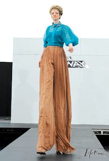
For the contestants first challenge using fabrics at mood, I found this challenge to be slightly ridiculous. I mean yes, Project Runway is known for doing challenges that are out there but this just was not something I'd ever have in mind. The challenge was to make an outfit for a stilt performer, I never knew they had to be fashionable but apparently they do...I didn't get the huge difficulty of this challenge, it was just longer leg proportions than usual. Well onto all the looks this challenge:
Anthony Ryan and Laura
I liked this look and it moved great on the runway. I felt this was a good ready to wear piece and Michael Kors said that if it was made shorter it could be worn by a non-stilt performer as well. I agree with Nina thought I was like I've seen this before and it wasn't that most imaginative design, it was reminiscent of Gucci's Fall 2011 RTW collection.
Pretty much a combination of these two looks made into a cheaper version was what they created this challenge but it was still a good look for the challenge. I like the sheer on the Gucci versions but it wouldn't look for the challenge since the stilts would show.

Anya and Oliver
I find this a lot like Anthony and Laura's in which if they made it shorter it would just walk off the runway fine. It was a nice design and I like the use of color but I felt it was a bit too safe, it didn't take a huge risk like I would have liked. This is another look that reminds me of a runway look this time taking from Alexander McQueen's Spring 2010 RTW.
When I saw the look, I immediately went I've seen this before it reminds me a lot of McQueen, who of course I love, but this was not a great version of the look at all.

Becky and Kimberly
This look was the most edgy of the bunch. I felt this look had a concept behind it and was nicely constructed. I felt the color was a bit strange but I think the jacket was really interesting and kept your attention while the pants were nicely made and went with the jacket.

Bert and Viktor
This outfit looked so bad. It looks like an outdated curtain was made into a dress from the Victorian Era. It just looks like a big bad mess and it was not photographed that well either. I like the fabric coloring in which it sometimes looks purple or green but not in the way it is used at all. It looks so strange and like a giant blob was moving towards you. This needed some restraint which neither of them showed. I can tell they didn't work well together since this was produced.

Bryce and Fallene
This was a huge snoozefest, it had almost nothing interesting about it and it was just one giant tutu with boring pants, boring top and almost no color. It looked like it had no concept, although if Fallene didn't mess up the top it might have been better but I don't imagine by that much.

Cecilia and Danielle
This outfit was nicely constructed and was a polished finished look. I think the chiffon top over that tanktop was a nice effect and those sleeves were a job well done. I think the pants looked good but it sort of looks wrinkly but that might be what they were going for with the pleating. A nice finished, tailored look but it wasn't a wow moment.

Joshua and Julie
This look just packs a lot of bold punches. It has that bold red top with that matador cape as a sleeve paired with that bold print on the pants. If this was a normal woman this might have been better since that much pattern really shows how off the proportions are and exaggerates it. I like that they at least had a concept and executed it but damn this was a lot of look in one outfit.

My favorite looks this challenge were: Anthony Ryan and Laura and Becky and Kimberly, although I wasn't overly impressed with the results of this challenge.

The worst outfits this challenge were: Bert and Viktor and Bryce and Fallene.

Who's design did I pick as the winning look?


Anthony Ryan and Laura! The outfit was a knockoff of Gucci but still the best look in this bunch.

The look that I felt was the worst and should definitely be out and never made again is......


Bryce and Fallene, this was just atrocious and not a single concept I can think of can rescue this terrible monstrosity.

~Anthony

Tuesday, August 9

that's so 70's


                             Jantzen Swimsuit/ Equipment shirt/ St John necklace/ Vintage hat


                                           Liquid Blue Swim suit/ Sweet & simple crochet vest


Here we got two different looks for our 70's beach outing. Lauren is wearing a one-piece swimsuit and covered it with a chiffon  shirt. She accessorized it with a pearl necklace which really brought the entire 70's classy outfit together. The vintage hat makes the outfit more intriguing as well. Michelle on the other, took the 70's theme to a different direction with her indie hair accessory along with her cream crochet vest. These small detailing turned her two-piece floral tankini into a bohemian styled 70's swim wear.

I hope you like our interpretation of the 70's. Although we are both in the same decade, you can take the 70's into any direction you are more comfortable with. Either way you will always look great!


Powered by Blogger.

Share

Twitter Delicious Facebook Digg Stumbleupon Favorites More