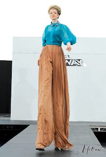
For the contestants first challenge using fabrics at mood, I found this challenge to be slightly ridiculous. I mean yes, Project Runway is known for doing challenges that are out there but this just was not something I'd ever have in mind. The challenge was to make an outfit for a stilt performer, I never knew they had to be fashionable but apparently they do...I didn't get the huge difficulty of this challenge, it was just longer leg proportions than usual. Well onto all the looks this challenge:
Anthony Ryan and Laura
I liked this look and it moved great on the runway. I felt this was a good ready to wear piece and Michael Kors said that if it was made shorter it could be worn by a non-stilt performer as well. I agree with Nina thought I was like I've seen this before and it wasn't that most imaginative design, it was reminiscent of Gucci's Fall 2011 RTW collection.Pretty much a combination of these two looks made into a cheaper version was what they created this challenge but it was still a good look for the challenge. I like the sheer on the Gucci versions but it wouldn't look for the challenge since the stilts would show.
Anya and Oliver
I find this a lot like Anthony and Laura's in which if they made it shorter it would just walk off the runway fine. It was a nice design and I like the use of color but I felt it was a bit too safe, it didn't take a huge risk like I would have liked. This is another look that reminds me of a runway look this time taking from Alexander McQueen's Spring 2010 RTW.When I saw the look, I immediately went I've seen this before it reminds me a lot of McQueen, who of course I love, but this was not a great version of the look at all.
Becky and Kimberly
This look was the most edgy of the bunch. I felt this look had a concept behind it and was nicely constructed. I felt the color was a bit strange but I think the jacket was really interesting and kept your attention while the pants were nicely made and went with the jacket.Bert and Viktor
This outfit looked so bad. It looks like an outdated curtain was made into a dress from the Victorian Era. It just looks like a big bad mess and it was not photographed that well either. I like the fabric coloring in which it sometimes looks purple or green but not in the way it is used at all. It looks so strange and like a giant blob was moving towards you. This needed some restraint which neither of them showed. I can tell they didn't work well together since this was produced.Bryce and Fallene
This was a huge snoozefest, it had almost nothing interesting about it and it was just one giant tutu with boring pants, boring top and almost no color. It looked like it had no concept, although if Fallene didn't mess up the top it might have been better but I don't imagine by that much.Cecilia and Danielle
This outfit was nicely constructed and was a polished finished look. I think the chiffon top over that tanktop was a nice effect and those sleeves were a job well done. I think the pants looked good but it sort of looks wrinkly but that might be what they were going for with the pleating. A nice finished, tailored look but it wasn't a wow moment.Joshua and Julie
This look just packs a lot of bold punches. It has that bold red top with that matador cape as a sleeve paired with that bold print on the pants. If this was a normal woman this might have been better since that much pattern really shows how off the proportions are and exaggerates it. I like that they at least had a concept and executed it but damn this was a lot of look in one outfit.My favorite looks this challenge were: Anthony Ryan and Laura and Becky and Kimberly, although I wasn't overly impressed with the results of this challenge.
The worst outfits this challenge were: Bert and Viktor and Bryce and Fallene.
Who's design did I pick as the winning look?
Anthony Ryan and Laura! The outfit was a knockoff of Gucci but still the best look in this bunch.
The look that I felt was the worst and should definitely be out and never made again is......
Bryce and Fallene, this was just atrocious and not a single concept I can think of can rescue this terrible monstrosity.
~Anthony


0 comments:
Post a Comment